 |
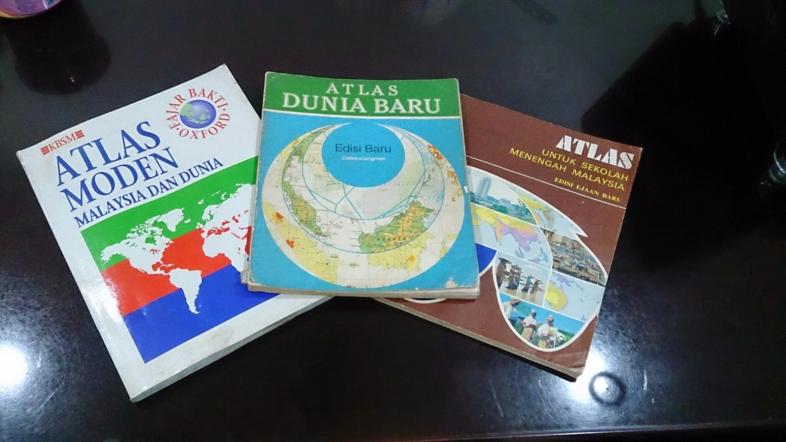
Three Atlases, Three Publishers, Three Time eras
|
As Malaysia recently celebrated its 57th independence day on 31st August, it is worthwhile assessing how this nation has progressed. Malaya, to be specific, got its independence from Britain in 1957 (Malaysia was formed in 1963) and hence, 57 years of independence is unique in its sense. One of the best ways to see progress and changes is to look at old and new national atlases. For this posting, I will be focusing more on Student Atlases' portrayal of Malaysia and how they have evolved over the decades. I will not comment on the production process of the atlas as the information is hard to sought by.
This study is segmented to the following parts:
Contents
Generally, I have noted the contents of the atlases from 1970s to 1990s have
not changed. Most of them open up with principles of mapping (i.e. projection, scale) and proceed to Malaysian and world content. In terms of Malaysian content, it is divided into three groups:
Physical Geography maps,
Human Geography maps and
General Reference Maps. In the General Reference Maps, Malaysian atlases do accommodate inset maps of key cities or economic activity area. These inset boxes focus on land usage and economic hotspots of the state or region. Despite constituting another half of Malaysia, Borneo Territories are
not accorded with a large scale map (for general reference category). The thematic maps of atlases are generally without any years attached and if they were, they are
outdated as much as 6-10 years (from the latest publication date)
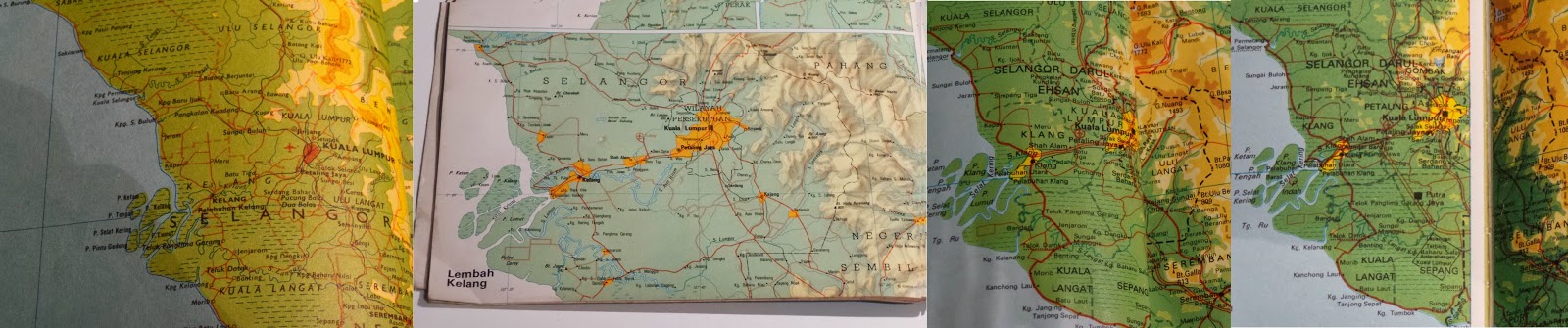 |
Evolution of Klang Valley (Most urbanized Area in Malaysia). From Left to Right:
1974, 1983, 1994, 1996 (2007 Edn Atlas) |
New names or change of spelling for places have been reflected over the years. For example, 70s atlas used to show Muar as Bandar Maharani (primary name). From 80s onwards, Muar became primary name choice for the town on the map. District names of Sarawak (the largest state) has undergone renaming decades ago. New reservoirs appear in the 1990s maps when none existed in 70s and 80s atlases. Despite the updated height, Malaysian geography text books and atlases still carry the
wrong height of Mt Kinabalu(it should be 4095 m instead of 4101 m). Emergence of highways criss-crossing the country began to
appear in 1990s atlases. With the opening up of new Kuala Lumpur International Airport (KLIA) in 1998, thematic aviation maps were
updated with the new location.
How did these Atlases
presented the
world?
Malaysian student atlases are published in accordance to the geography syllabus and textbooks. From 1970s to 1990s, the atlases had a major emphasis on Regional South East Asia (on a country-to-country basis), followed with serious coverage of Asia. For the rest of the world, these atlases gave more space for North America and Europe. As most of the atlases has their publishers one way or another related to UK, large scale maps of UK are presented in the atlases. Africa and South America, despite their sizes, are displayed in one page maps. This skews supposed Malaysian world view to Asia, Europe and North America (a bit of Australia)
Colour Scheme
My analysis and observation states that atlases produced prior to 1980s (be it Malaysian or International ones), they have strong colour contrast scheme (refer to image above). Specifically, this is very true for topographic relief. The first thing you will see on topographic maps of Malaysia and World in pre 1980s atlases is topographic relief. In this sense, this colour scheme serves the purpose. However, it makes reading of text on the map very hard. For example, Times Atlas of the World (Mid-Century Edition of 1950s) had significant contrasting colours for relief that readers struggle to deduce thousands names dotting the map. Secondly, maybe due to printer issue or other reasons, I have noticed thematic maps have colours not matching their boundary grouping. For example, if the sea is indicated white and agricultural land is yellow, it is possible to see older atlases that some white exist on the landmass. It is subtle.
From 1980s, with better technologies and other reasons, the strong contrasting colour scheme was phased out and replaced with smooth colour transitions. Colours used for topographic maps or thematic maps for atlases show gradual variation and most importantly, toned down. It still captures people attention to relief but this time, not compromising text legibility. Strong colour schemes are only used for certain cases (i.e. 3D Model - none of the Malaysian Atlases have explored this option).
Current situation of atlases
Unlike the glory days (until 80s or even 90s), number of companies producing atlases have went down in Malaysia. Prior to 90s, it was possible to see different publishers producing their own set Malaysian student atlases. Currently I believe there are two companies who produce Malaysian atlases (specifically for students or reference material)- Oxford Fajar (Oxford University Press division in Malaysia) and World Express Mapping Sdn Bhd (WEMS). Oxford Fajar updated their mid 90s Atlas Moden Malaysia dan Dunia (Modern Atlas of Malaysia and the World) until 2007. However, the update was more like changing the cover (to reflect 50 years of Oxford Fajar in Malaysia). The contents in this 2007 atlas had maps reflecting situation of late 1990s (This is a gap of a decade between the publication year and the contents)
Newer atlas from Oxford - Atlas Explorasi Geografi (Geography Exploration Atlas) released recently is more like a book with some simple maps. These newer atlas has discontinued tradition of Oxford produced maps of Malaysia and World for the past decades. The content is more geared to text and the maps were there to reinforce the geographical understanding.
WEMS also released Atlas Geografi Dunia (World Geography Atlas) both in Mandarin and Malay. I had short glimpse on the contents of this atlas. Most of it simple topographic maps of Malaysia and World.
Conclusion
In short, Malaysia no longer has good atlases that reflect the identity of the nation. Other countries can serve a good example on continuing the strong tradition of atlases in combination with GIS and web capabilities. In Australia, hardcopy Jacaranda Atlas is updated with GIS and is accompanied with online counterpart. This atlas is standard mainstay for all geography students in Australia. Likewise, Oxford produces its Australian atlases and has similar content to Jacaranda. Malaysia no longer has any of this.
The best way forward is the existing publishing groups in Malaysia recapture the older atlas style, combined with GIS enabled updates and have online counterpart. These atlases are very dynamic, interactive and bound to make students get excited in geography.
Referred Atlases
- Atlas Untuk Sekolah Menengah Malaysia (Atlas for Malaysian Secondary School), 1977, Far Eastern Publishers (FEP) International Sdn. Bhd.
- Atlas Dunia Baru (New World Atlas), 1983, Collins So & co Ltd/ Longman Malaysia Sdn Bhd
- Atlas Moden Malaysia dan Dunia (Modern Atlas of Malaysia and the World), 1994, Penerbit Fajar Bakti Sdn. Bhd. (Oxford Fajar - currently it is called as)
- Atlas Moden Malaysia dan Dunia (Modern Atlas of Malaysia and the World), 2007, Oxford Fajar Sdn. Bhd.
